
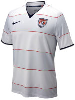
 Can someone please explain to me why US Soccer wants our team to look like we’re wearing pajamas on the pitch? This new kit is just horrible and makes you long for the 3rd kit to come out more often. But those are pajamas too. Insert obligatory Bananas in Pajamas quote here.
As if we weren’t a laughingstock already… Lets start a pool to see how long it takes for an opponent exchanging jerseys to tell a US Player “here you can have mine but keep yours – I’m good” Why is it Nike seems to think soccer kits have to be bland and striped. The brighter and more colorful the better.
Is it really that hard to come up with some type of bright red and blue jersey? Sure, navy isn’t the most striking color, but if you use Royal for a 3rd kit, maybe you can use it as a stripe for one of the others. And when we finally find someone who will design a kit we’re proud of – can we stick with the color?
Of course I’m not sure how much we have to worry about the US Soccer kits being hard to recognize on sight like Brazil or the like. As soon as someone sees us they have to be thinking ‘Wow – what an ugly kit – must be the US’
Here’s an idea – browse through kits from the likes of Nike, adidas, Score, High Five, Teamwork Athletic, or any other and post your favorite style that the US could wear. Post links in the comments – this could be fun. Bonus points if you chose 1st through 3rd kits.
H/T Josh and Fish who don’t like it either.


January 31st, 2008 at 11:08 am
I kinda like the new kit. It’s certainly different, though. Personally I don’t care what the kit looks like – as long as they are winning and putting themselves into a position to have a solid World Cup in 2010.
BTW – against all better judgment – I have been recently lurking on the nc-soccer forum. I know, not a smart move – but it’s been refreshing to see that hatred, distain and name-calling are still alive and well in youth soccer. I saw your name bashed around in at least one place. So much for benevolence …
January 31st, 2008 at 11:11 am
Ah nc-soccer can be fun if you have a thick skin. I’m certainly not naive enough to think I’ll change anyones mind. Hate I missed where I was bashed around – that’s always half the fun! If they’re bashing you, hopefully it’s because you’re speaking the truth and opening some eyes. Who knows 🙂
January 31st, 2008 at 11:23 am
I know – it’s off the new kit topic – but I only have a medium-thick skin. I have learned from past experiences to know to simply keep my trap closed because if someone decides to get nasty – I can be equality if not more vile. So now I leave well enough alone and just enjoy the spectacle.
Back on topic – I think jerseys with vertical strips are rather cool.
January 31st, 2008 at 11:42 am
I like thick vertical stripes. My U10 Rec team has this uniform in Red:
http://jogosoccer.com/newcastle.asp
and it’s fantastic – they look REALLY sharp. Still think thin stripes look like pajamas but just me 🙂
As for skin thickness. I try REALLY hard not to get drawn into shouting matches – I just want to state the facts as I knwo ro see them and move on. But I rarely succeed at this 🙂
January 31st, 2008 at 12:08 pm
I like the Fulham away kit. Hopefully they will avoid relegation! I have followed them since Eddie Lewis was onboard WAY BACK when.
http://www.fulhamfc.com/Club/News/NewsArticles/2007/June/NewAwayKit.aspx